Showing posts with label NPR. Show all posts

Tuesday, July 21, 2020

COVID-19: Down the Rabbit Hole of Death Rate Calculations - Part 7

Note: Written June 30th

Based on my calculations [see my last post], which were based on antibody testing done in New York where they calculated "19.9% of the population of New York City had COVID-19 antibodies," my worst case death rate if we do nothing more than wait for herd immunity we would see 1.97 to 2.68 million of our fellow Americans dead assuming 70% needed to reach herd immunity.

I know that number will be less than that based on the fact that some of us are taking precautions as well as changes in the way we treat the sick resulting in less deaths. How much of a decrease in my numbers depends on a lot of factors, so worst case of doing nothing will see a lot of deaths, even if you reduce the 70% needed down to 50% for herd immunity.

How does the antibody testing done in New York compare to the testing they did in Boston?
Mayor Martin J. Walsh, together with Massachusetts General Hospital (MGH), and the Boston Public Health Commission (BPHC), today announced the study to evaluate community exposure to COVID-19 through a representative sampling of asymptomatic Boston residents resulted in 9.9% testing positive for antibodies and 2.6% of currently asymptomatic individuals testing positive for COVID-19. In conclusion, approximately 1 in 10 residents in this study have developed antibodies and approximately 1 in 40 currently asymptomatic individuals are positive for COVID-19 and potentially infectious. 
Let's do the same process as we did in the last post.
More than 5,000 residents living in East Boston, Roslindale or within the boundaries of zip codes 02121 and 02125 in Dorchester were invited to voluntarily participate in the study, with total outreach representing more than 55% people of color. Approximately 1,000 residents expressed interest in participating and 786 residents were deemed eligible. Of those, 750 residents enrolled in the study and received the required testing. Residents with symptoms or a previously positive COVID-19 test were disqualified from the study.
So...1 in 10 residents in this study have developed antibodies EXCLUDING those who have tested positive and recovered. Let's settle on a date of May 15 for the News Release and May 12 for the last day they looked for antibodies.If we say that everyone's outcome was resolved on May 12, you either had antibodies or you were dead. And if you died, we got your death reported at least by May 19 (7 days).

If this is the case, then the numbers look like this for the IFR:

Source
Source

Interesting...An IFR of 0.86% was also calculated with NYC.

Right now we have so reasonable data from which to work. We know dates, we now counts, we can make some calculations and we can make some assumptions. It is unfortunate that we will not know a 'true' number until the end. What we can know are reasonable numbers based on what we see, and, using those number we can rule some things out.

Looking at the data from Boston and NYC as well as the current data as of 6/26/2020, here is what we get:

For Boston, we had 11,395 confirmed cases for 69,458 (10% of Boston) assumed  past infected.Using these two numbers, we can assume that for every known case (11,395) the are 6.095 times more cases that were not reported.

Using those numbers, we can get an estimate as to how close out calculated IFRs are using US data for the whole country.


If our infected to confirmed cases ratio is correct, then the best fit for the deaths reported is an IFR of 1.17%

If we use NYC's numbers, the ratio of confirmed cases to assumed past infected is 1 to 10.02:


However, that ratio estimates way more deaths then reported.

If we work backwards, that is we have the reported deaths and we have an estimate of infected (as of 5/25), the IFR calculates as follows:


Assuming nothing has changed, that is the same number of non-tested people remains as per Boston (1:6) or NYC (1:10) we should be able to see very close numbers now that we are into this epidemic by another month.

We have death data as of June 26. Assuming there is at least a 14 day lag between a case being reported, death, and posting of that death, we can look at the cases as of June 12.
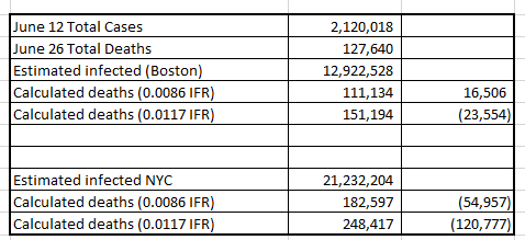

In my opinion, the best model that takes into account what we have seen based on reporting is the Boston numbers. That is, for every confirmed case there will be six unconfirmed positive cases. 

The IFR, however, is a different story. In the beginning it was 1.17% that would get you close to the actual deaths reported. As time goes on, that number drops to 0.8%.

There are a couple of things going on here that could be impacting the IFR:
  1. The number of deaths from COVID is decreasing due to better care
  2. More vulnerable have died already 
  3. Less older folks are getting infected with youth driving up the numbers and therefore less deaths from that age group.
  4. The number of confirmed cases now includes more asymptomatic cases that were not known to be infected early on (decreasing the ratio to be less than 1:6)
To my way of thinking, we should not see to big of a jump in the IFR between what was calculated before May 11 and what has happened from May 12 to June 28 (the latest date I have access to).

The estimated IFRs should hold close, If the IFRs do not calculate the deaths seen from this period, something has changed. I suspect it is all four of the above with number four being the primary driver as we ramp up testing.

Let's go down that rabbit hole and see.

Part 8

COVID-19: Down the Rabbit Hole of Death Rate Calculations - Part 10

Note: Written July 7

Where are we? Oh yeah, something about deaths only 5.9% above normal...

That statement was made when the graph below ended at the right edge of the purple box. Since this series of blog posts is taking me a bit longer than I thought to write, the number of cases - and therefore deaths - keeps marching on.

The June 25 number of deaths was 127,532. Assuming a 14 day lag from reported cases to reported deaths, the last cases would be June 11 and at that time the numbers were 2,091,812 total COVID-19 cases reported.

We once again come back to the Infection Fatality Rate (IFR) and that brings us back to how many people were actually infected, not the number reported as cases.

In a previous post I calculated that Boston shows us 6 not reported to each reported. New York City shows 10 infected to each one reported as a cases. Those numbers were early on and I think them appropriate for what took place in April. I believe we have a better understanding of what is taking place looking at the Diamond Princess for example.

In this video, a screen shot of the data he was using shows this:


Let's assume that these numbers represent the population in the US as of June 11. What this video contends is that 37 + 21 = 58 out of 155 asymptomatic had the antibodies, Of those that had symptoms, 25 tested positive for the virus.

Assuming that those with symptoms go and get tested, and only positives are reported, we would have 25 reported and 58 unreported. So for every positive reported cases there are actually 2.32 more cases.

25 reported, 58 unreported for a total of 83 infected.

Using this logic...

The number of cases from June 12 through June 22 was 298,465. If we add to that 2.32 times more asymptomatics that were assumed not tested, that gives us a total of 990,904 infected.

With a total of 5447 deaths for that time period (14 day lag in reporting), we get a Case Fatality Rate of of 1.83% and an Infection Fatality Rate of 0.55%.

If my calculations are correct...if my assumptions are correct, by July 20th we will have 24,102 deaths from the cases reported after Memorial Day, May, 25 - a 56 day time frame.
  • Cases after May 25 through July 6 = 1,320,681
  • Estimated Infected = 4,384,661 (tested plus untested asymptomatic)
  • Estimated deaths for this 56 day period starting on June 8th: 24,102
  • Actual deaths reported from June 8 through July 20th - 56 days: ????
Out of the rabbit hole for a bit. 

I'll be back after July 20th to see how close my estimate of the deaths were. If it is more than what I calculated then the IFR is higher and we can expect a lot of deaths as we try to get closer to herd immunity of most likely 70% of the US population needing to be infected.

Part 11 coming after July 20th....


COVID-19: Down the Rabbit Hole of Death Rate Calculations - Part 9

Note: Written July 7

You are Donald Trump...or any other non-science/non-public health educated person in a leadership role.

You are looked at to do something...take precautions to keep people safe or hurt the economy. It is not an either/or decision, but unfortunately that is how it was presented.

You may have your own opinions about risk, about life and death...but in the end, the decisions you make are, at the very least, backed up by data that you can point to an say "...this is what I was told."

I am on my 9th post on this topic of the death rate associated with COVID-19 because the data has been contaminated and manipulated to paint a picture that ...it aint that bad...its no different than the flu...it will fizzle out...

So you are Donald Trump and your CDC gives you this 49 page report, that - let's be honest - you will not read. But you can look at the pretty graphs, and the graph you fixate on - because its the one that most people are concerned with - is the number of deaths.

And the CDC shows you this:


Even Trump can look at this graph and come away with an idea as to what is happening. But just to make sure, the CDC tells him:
This is the ninth week of a declining percentage of deaths due to PIC; however, the percentage remains above the epidemic threshold of 5.9% for week 25.
Trump: "What's that mean?"

CDC: "Well boss, we are now only 5.9% higher in deaths then we normally would see at this time."

Trump: "6%...so we are pretty good...would you say tremendous maybe?"

CDC: Well if you look at the data, 6.9% of all the deaths that week were due to pneumonia, influenza or COVID-19.

Trump: So 7% of the deaths were not just from COVID-19...its also the flu and pneumonia?

CDC: Well sir, if you look at how things were in 2018 with just the flu, we are less deaths than that...

Sycophants: And no one shuts down the economy over the flu!

Me: But sir...let me explain what's happening....

Sycophants: Shut up Bowman!

Well this is my blog and I don't have to shut up. Let's look at the graph with some context.

In a bad year, like 2018, the flu infected an estimated 45,000,000  Americans - and that was with a large percentage of people having received a flu shot.

On June 20th we had a total of 2,334,098 confirmed cases of COVID-19. Now go back and compare the the flu death bump for 60 million infected with the COVID-19 bump with as of June 20th 2.3 million infected.. .

When the CDC tells the people that as of June 25th we are only 7% higher than what we normally see at this time for all deaths it sort of sounds like we got it under control! We win! USA...USA...

That graph tells us a percentage of death due to infection. This works well if your goal is to convince the public that the red line is now about the same as what we see with the flu...and no one shuts down the economy for the flu. 7% higher...Pffft!

In the end though, it is all about the deaths that I am interested in. And right now, we are looking at this:
  • 127,532 deaths as of June 25 from 2,091,812 COVID-19 cases as of June 11 (14 day death lag)
  • 46-95,000 deaths from 45,000,000 cases for flu 2017-2018.
...and Mr. Toad's Wild Ride is not over yet.

When the CDC tells the president that we are only 5.9% higher in deaths then we normally see at this time, it sounds...reasonable. But it ignores the epidemic part of the equation...it ignores exponential growth...


The purple box represents what we assume to know about the number of deaths as of June 25th from the cases starting at 0 to June 11th.

The purple box represents 127,532 deaths. What will we expect from the red box? What will we eventually see at the end date of zero infections and the last death associated with COVID-19?

This is what the infection fatality rate becomes critical in the thinking process. If 5.9% above is acceptable because its only 5.9% above what we normally see, and below what we accept with the seasonal flu, then maybe all this worry over it being a concern is misplaced.

5.9% was the right edge of the purple box. What does the red box tell us?

This rabbit hole is way too deep!

Part 10

COVID-19: Down the Rabbit Hole of Death Rate Calculations - Part 6

Note: Written June 26th

Using information from the Diamond Princes, I calculate an Infection Fatality Rate (IFR) of 5.6%. This assumes that the total number of infections can be obtained by knowing the number of confirmed cases and adding 17.9% more to cover the asymptomatic cases that were never tested because,,,well they never knew they were sick.

The issue with this IFR calculation is that it is based on what took place within a population with a median age over 60.

Need more better data!

The WorldoMeters calculates a mortality rate by looking at antibody testing performed in New York and the data out of New York they reported this.
Considering that a large number of cases are asymptomatic (or present with very mild symptoms) and that testing has not been performed on the entire population, only a fraction of the SARS-CoV-2 infected population is detected, confirmed through a laboratory test, and officially reported as a COVID-19 case. The number of actual cases is therefore estimated to be at several multiples above the number of reported cases. The number of deaths also tends to be underestimated, as some patients are not hospitalized and not tested.
Based on the "analyzed the data provided by New York City, the New York State antibody study, and the excess deaths analysis by the CDC. Combining these 3 sources together we can derive the most accurate estimate to date on the mortality rate for COVID-19, as well as the mortality rate by age group and underlying condition."
The survey developed a baseline infection rate by testing 15,103 people at grocery stores and community centers across the state over the preceding two weeks. 
What they found was:
  • 12.3% of the population in the state had COVID-19 antibodies as of May 1, 2020.
  • 19.9% of the population of New York City had COVID-19 antibodies.
Looking at New York City...:
With a population of 8,398,748 people in NYC, this percentage would indicate that 1,671,351 people had been infected with SARS-CoV-2 and had recovered as of May 1 in New York City. The number of confirmed cases reported as of May 1 by New York City was 166,883, more than 10 times less.
What this says to me is that if you were tested and found with antibodies you were past the active infection period and on May 1 you had ether recovered or died. I am going to calculate this a bit different than WorldoMeters because I am going to assume the deaths on May 1 happened 7 days prior. So I am going to look at the deaths reported in NYC on May 9. [I am using 7 days to account for the lag in reporting the deaths, so if we stop on May1 our deaths should - should - be accounted for in the May 9th report]

The IFR is therefore [total deaths] divided by [total recovered plus total deaths].This gives me the pool to pull from, what portion died and what portion survived.


If the New York serum data is correct, we have an IFR of 0.86 to 1.17%. What this could mean in terms of deaths of real people should we continue down the path of waiting for herd immunity as the stopping point looks like this:


If my calculations are correct, and y'all can check my math, if we rely on herd immunity - as some are recommending - we could see 1.97 to 2.68 million of our fellow Americans dead assuming 70% needed to reach herd immunity.

Maybe Boston presents a better estimate...

Down the rabbit hole to Boston we go!

Part 7

COVID-19: Down the Rabbit Hole of Death Rate Calculations - Part 5

Note: Written June 26th

Where are we, as of this date - June 26 - in terms of our outlook for death from COVID-19 in the US?

I can state pretty conclusively using data from all over the world that at least 2 people will die from every 100 confirmed cases of COVID-19. I showed that in my past blog. This calculation, we are told, is the Case Fatality Rate (CFR). The Big Kahuna we need to know is the Infection Fatality Rate (IFR).

The IFR is the number of deaths divided by the number of people who contacted COVID-19, This includes those that are symptomatic and those that are asymptomatic. The conventional wisdom appears to be that more people are symptomatic -and therefore - not tested.

There seems to be supporting evidence for this which I want to look at.
Arons et al. now report in the Journal an outbreak of Covid-19 in a skilled nursing facility in Washington State where a health care provider who was working while symptomatic tested positive for infection with SARS-CoV-2 on March 1, 2020. [New England Journal of Medicine]
Here we have a 'ground zero' situation. The assumption here is that this one worker passed on the infection to those in the nursing home. 
Residents of the facility were then offered two facility-wide point-prevalence screenings for SARS-CoV-2 by real-time reverse-transcriptase polymerase chain reaction (rRT-PCR) of nasopharyngeal swabs on March 13 and March 19–20.
12 days later the residents were tested with the nasal swab looking for the virus - not the antibodies.
Among 76 residents in the point-prevalence surveys, 48 (63%) had positive rRT-PCR results, with 27 (56%) essentially asymptomatic, although symptoms subsequently developed in 24 of these residents (within a median of 4 days) and they were reclassified as presymptomatic.
This is for the residence - which being in a nursing home - would most likely be impacted by a viral infection like COVID-19.
An important finding of this report is that more than half the residents of this skilled nursing facility (27 of 48) who had positive tests were asymptomatic at testing.
 Yet, four days later 24 of those 27 became symptomatic. The reason this is deemed important in this study is they are looking at transmission. I am looking at how many asymptomatic folks would likely never get tested and should be added to the denominator when we do the IFR calculation.

Looking at this data, it would appear that only three out of 76 would never have bothered to get tested as they remained asymptomatic. But these are old people in a nursing home so they are possible much more susceptible to the virus. Still, we can add this to the list in trying to understand what is actually happening in the real world.

Let's look at older people that are not in nursing homes. The Diamond Princess is, I think, the best example of what we might see in the rest of the world. The only exception here is that the passengers were older than the general population and therefore possibly more likely to show symptoms.
On 5 February 2020, in Yokohama, Japan, a cruise ship hosting 3,711 people underwent a 2-week quarantine after a former passenger was found with COVID-19 post-disembarking. As at 20 February, 634 persons on board tested positive for the causative virus. We conducted statistical modelling to derive the delay adjusted asymptomatic proportion of infections, along with the infections’ timeline. The estimated asymptomatic proportion was 17.9% (95% credible interval (CrI): 15.5–20.2%). [Stanford]
Let's assume that for every confirmed case there are at least 17.9% that we do not know about. What we would now see as the IFR - confirmed cases and asymptomatic never tested - would look like this as of today - June 26:


This assumes that the deaths reported as of June 26 came from the reported cases as of June 4 (see previous post on why 22 days). Based on the reported cases we can add 17.9% more cases we suspect are asymptomatic and were never tested.

Still...this is old people data. Let's look at something a bit more representative.

Dig deeper! The rabbit is in there somewhere!

Part 6

COVID-19: Down the Rabbit Hole of Death Rate Calculations - Part 4

Note: Written June 25th

The Infection Fatality Rate - IFR - is the key to the models. And the models are what we use to determine the effort we need to put into our response.

That 'F' is a person...a child, parent, grandparent...a friend. We owe it to them to get the response as close to perfect as we can. "Oops, I was wrong" ain't gonna cut it here.

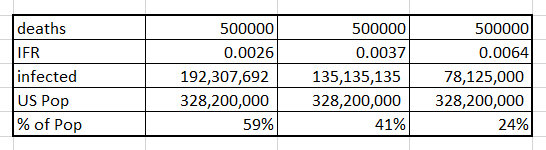
Last post we talked about the German study that said the IFR was 0.37%. We previously talked about the CDC using 0.26%. The other paper NPR referenced puts it at 0.64%.
The CDC's current "best guess" is that — in a scenario without any further social distancing or other efforts to control the spread of the virus — roughly 4 million patients would be hospitalized in the U.S. with COVID-19 and 500,000 would die over the course of the pandemic. [NPR]
To get 500,000 deaths you will need this many infected people at these different IFRs. The lower the IFR the more people who can be infected to get the same number of deaths, 500,000:


We need to know what that IFR is, because the number of infections does not care about the number of deaths, until the number of deaths limits the number of people who can be infected. At some point we reach this thing the call herd immunity where the number of previously infected gets in the way of the virus finding new uninfected people.

We have three things in play here. One, the virus dies out because of weather. Second is we reach herd immunity or third, we develop a vaccine. All of these things can be in play at the same time and that impacts the number who will get COVID-19.

In the US population there is some unknown number of people who COULD get COVID-19. In the absence of anything else coming into play, we can reasonably make a guess that at some percent of the population we will have reached herd immunity and the virus will go "poof" and "be on its way out."

 According to the Mayo Clinic:
Even if infection with the COVID-19 virus creates long-lasting immunity, a large number of people would have to become infected to reach the herd immunity threshold. Experts estimate that in the U.S., 70% of the population — more than 200 million people — would have to recover from COVID-19 to halt the epidemic.
Let's go with that number of 200,000,000 people needing to get infected in the US for herd immunity to be viable:


My concern is that the ACTUAL number for the IFR is at least 1%. If I am correct, then to reach herd immunity at least 2,000,000 Americans will die. Now that number is if we do nothing but rely on herd immunity. If you look at compliance with social distancing and mask wearing, we are probably about 50% compliant based on what I see day-to-day.

Diving deeper into the rabbit hole of death rate, let's look at some numbers.

First, let's agree on some time frames. From the CDC:
  • Time from exposure to symptoms onset: 6 days on average.
  • Time to seek care as an out patient: 2 days average.
...and for Mr. Death:


Let's do death math!


We need to make some assumptions here. The numbers we get are not perfect, but with so much data things should wash out and be close to what we need to say confidently this is what we are seeing.

We need to assume that the positive tests we had on May 1 either recovered or died. And if they died, we knew about those deaths by May 21.

Now you may be saying, but Bowman, you are calculating the Case Fatality Rate with this! Yes...but I want to figure out the Infection Fatality Rate by understanding how many untested people we have that were also infected with COVID-19 by using these known cases.

I have three ways to get an estimate of that number that I think are both valid and "good enough" to get an idea. We can look at the data from the Diamond Princess cruise ship, Testing done in New York looking for antibodies, and testing in Boston looking for antibodies.

These assumptions above will get me to a number of deaths from COVID-19 that I need to calculate the IFR. Once I know the number of asymptomatic cases that have not received a positive case result I should be able to get a ratio of tested to the total infected. So if you say we had 22,258 new cases on June 2, we would have some number more of asymptomatic people that were not tested.

That ratio, I think, should remain constant only changing when we test more asymptomatic people and catch them with the virus. As an example, if 10% of the population had the antibodies with a population of 100,000, then 10,000 people were infected. If on that date we go two days into the future the accumulated number of those testing positive will give us a ratio. So if  one thousand tested positive, you could say that for every one positive test there are nine other asymptomatic.

Now whether the pool should be asymptomatic plus confirmed or assume that the 10% includes all of those who were infected is open for debate. I can run the numbers both ways to get an idea.

If this ratio holds over time, then I can get an estimate of how soon we should hit herd immunity. The problem here is that I don't know how many COVID-19 tests looking for the virus are now finding those asymptomatic that would not have been tested when this data was collected in New York and Boston.

I suspect that since we are doing more testing we are catching the asymptomatic that went for testing because they knew they were exposed. If that's the case, then later on the cases reported will now be closer to the all infected and my ratio will not be valid.

So here we go deeper, deeper, and deeper into the rabbit hole of death rates by heading over to Boston.

Part 5

Sunday, July 14, 2013

NPR does Arsenic, Apples, and Rice

On my way home from Texarkana I heard a short story on NPR regarding the FDA developing a threshold for arsenic in Apple Juice.
Here's some news for parents of the sippy-cup crowd: The Food and Drug Administration has proposed a 10 parts-per-billion threshold for levels of inorganic arsenic in apple juice. This is the same level set by the EPA for arsenic in drinking water. Right now, there is no FDA standard for apple juice.
Not this again, I thought.  I wrote about this...a lot, in a number of posts starting with this one for Apple Juice;  Apples, Arsenic, and Risk - Part 1: One in 500 and this one for rice; Arsenic in Rice: Part 1 - We Meet Again.

I am no fan of Dr. Oz and Consumer Reports for taking on this topic.  The science does not support their conclusion of risk.  All you gotta do is read my 30 or so posts to see that.  Or you can trust me, I write a blog.

My argument as to why it is bad science is based on this concept of toxicology:
If the dose is low enough even a highly toxic substance will cease to cause a harmful effect. The toxic potency of a chemical is thus ultimately defined by the dose (the amount) of the chemical that will produce a specific response in a specific biological system.
That's what they tell us on the Yale web page that defines the term "dose." That's the same thing Dr. Honeycutt with the Texas Commission on Environmental Quality (TCEQ) states:
The phrase, “the dose makes the poison,” is attributed to the ‘father’ of toxicology, Paracelsus (1493-1541). What he described was the dose-response concept and it is one of the fundamental ideas in assessing risk, in that, typically at higher doses the severity of an adverse effect increases.
I describe dose as a threshold and have shown it in my past posts as a line in the sand.


So the FDA is going to make "10 ppb" the new safe threshold.  Yay!!  Now apple juice that is less than that will be "safe."  Glad we got that settled.  So what's my issue?  Well for one thing - for the only thing in my opinion - that 10 ppb a'int based on science!
"We are pleased to see the Food and Drug Administration taking this action," says Urvashi Rangan, director of consumer safety and sustainability at Consumer Reports. "Proposing a 10 ppb guidance for apple juice — the same level set for water — is a reasonable first step in protecting consumers from unnecessary exposure to arsenic."
No, no it is not "reasonable."  Reasonable is based on the science of toxicology and risk. That 10 ppb in water, the MCL, is based on the safe dose of arsenic in drinking water.  That safe dose is derived from looking at the risk of 10 ppb in one liter of water.  It is based on a lifetime consumption of 2 liters of water over a 70 year lifetime.
Lifetime HA is for a 70 kg adult. The daily drinking water consumption for the 10 kg child and 70 kg adult are assumed to be 1 L/day and 2 L/day, respectively. The Lifetime HA for the drinking water contaminant is calculated from its associated Drinking Water Equivalent Level (DWEL), obtained from its RfD, and incorporates a drinking water Relative Source Contribution (RSC) factor of contaminant-specific data or a default of 20% of total exposure from all sources. (EPA)
Setting the dose - or safe threshold - for arsenic in apple juice to 10 ppb means that Consumer Reports thinks it reasonable that 2 liters of apple juice will be consumed for 70 years.  That's what I take issue with.  The safe level is not based on science and Consumer Reports should be basing their being "pleased" on science. Period


So what happened here?  FDA caved in to public pressure.  You can fight for science, but you are going to lose when science based organizations like Consumer Reports are incapable of grasping the concept.

Basically FDA found that almost all Apple Juice contains less than 10 ppb of arsenic anyway, so let's give the baby their bottle and make the safe threshold 10 ppb.  Done!.  But...but...that's not based on science.  Put a cork in it Bowman, this battle is over.  Science lost and the public is made stupider for thinking 10 ppb is "safe," but in the end, everyone wins.  Well, except science...

On the positive side, NPR just moved up a couple of notches in my book.  Well at least Allison Aubry did.

Here is how she summed it all up.
I would say, overall, Audie, for apple juice, I think the message is stand down. I mean, I can tell you as a mom of three children, from teen to toddler, I used to worry about all of these things. But if you look at the science here, if arsenic is limited down to 10 parts per billion, I think that this is something that we can mark off our worry list.
Thank you Allison Aubry...thank you!  That's exactly what I spent tens of thousands of words trying to show.  That sounds so good to hear her say that:
But if you look at the science here, if arsenic is limited down to 10 parts per billion, I think that this is something that we can mark off our worry list.


.

Sunday, November 20, 2011

Poisoned Places: Part 2 - Smack dab in the middle of it!

Here is what NPR has to say about their Special Series NPR News Investigates called: "Poisoned Places: Toxic Air, Neglected Communities."
Two decades ago, Democrats and Republicans together sought to protect Americans from nearly 200 dangerous chemicals in the air they breathe. That goal remains unfulfilled. Today, hundreds of communities are still exposed to the pollutants, which can cause cancer, birth defects and other serious health issues. A secret government 'watch list' underscores how much government knows about the threat – and how little it has done to address it.
In my last post, I wrote about one of these "poisoned" places, Hayden, Arizona, Titled "EPA Takes Action Against Toxic Arizona Copper Plant."

According to NPR there is a "secret government 'watch list' underscores how much government knows about the threat – and how little it has done to address it."  So what is this secret government 'watch list' NPR speaks of?
The Bush administration's EPA faced criticism for not being tough enough on chronic polluters, so in 2004 it created a confidential watch list to manage the problem.
According to EPA reports, when regulators don't crack down within nine months of learning that a facility is a chronic or serious violator of the rules, the facility automatically pops onto the watch list. As a result, the agency says, some facilities may end up on the list in error.
Some of the facilities on the list likely are the "worst of the worst" polluters, but others may be breaking the rules in ways that do not pose significant risks for human health or the environment, says Grant Nakayama, who headed the EPA's enforcements under President Bush.
Apparently, Hayden, Arizona is on that secret list.  Is it a "worst of the worst" polluter or is it on there for  "breaking the rules in ways that do not pose significant risks for human health or the environment?"

That's an important distinction for two reasons.  One, you imply poisoning when you call someone a polluter, this leads to fear, concern, and stress for those who live in that "place."  Two, we have limited resources to spend, lets take that money and protect human health and the environment from real danger, not perceived risk.  Soapbox /off

Let's also look at the question: "how little it has done to address it."

“The bottom line is that the whole town is contaminated,” said Betty Amparano, who was born in Hayden and has lived here most of her life.  Which led the Center for Public Integrity to write:
In some families, generations claim to have suffered ill effects from bad air. Deaths from cancer are common. Regulators have done little; for people who live here, the sense of betrayal is profound.
Is there any way possible to look at this objectively?  I mean you have a town that is located for the most part within a factory that smelts copper ore.  What possible conclusion can one come up with other than the people in Hayden, Arizona have been "poisoned" and there has been "little done to address it."

Let's look at the evidence the NPR and the Center for Public Integrity put forth to support the claim of a "threat" and a "sense of betrayal."

1. We have a copper smelter
2. The town is right next to the copper smelter
3. We have citizens claiming they "suffered ill effects from bad air."
4. The Center for Public Integrity states "deaths from cancer are common."
5. "A copper smelter failed to keep toxic air pollution in check."
6. "The state failed to lean on the smelter’s owner, Asarco."
7. "The federal government failed, until days ago, to override the state."
8. A "finding of violation" claims the company has been continuously emitting illegal amounts of lead, arsenic and eight other dangerous compounds for six years.
9. The EPA says its monitors detected lead at two to three times federal limits on some days during 2011.
10. The EPA ordered Asarco to remove and replace the soil from more than 200 yards in Hayden after finding soil contaminated with lead and arsenic.
11. Does the smelter have a "License to Pollute" as the Center for Public Integrity claims in their video on the NPR web page?

Let's get 1 and 2 out of the way.  Yes, there is a copper smelter and the town is right next to it.  When you look at the EPA map and the satellite photo, it looks like a bad place to live.  The copper smelter in Hayden, Arizona has all the bells and whistles needed to make such a "poisoned places" claim.  I mean, look at this map from the EPA that they handed out to the community:


Handouts from EPA’s Open House and Community Meeting, January 9, 10, 2008

Maybe a satellite image might work a bit better:


Google Maps
Do you see what I see?  They built a smelter right smack in the middle of the town of Hayden Arizona!  That's similar to putting the Alamo smack dab in the middle of San Antonio, Texas!

Alamo in San Antonio, Texas


You can understand why Hayden citizen Betty Amparano sees it as failures "that all but ruined this wisp of a town occurred on multiple levels."

But here is one of the facts in play.  Hayden and Winkelman are there because of the copper smelter.

According to the EPA:

EPA Region 9 HHRA Report - Full
This is one of the fundamental problems we have in looking at the risk of an operation, such as a smelter or refinery, in an objective manner.  What is the risk now, not what was the risk pre-1990 Clean Air Act or the contamination that resulted before we had the environmental laws we now have in place.

The fact of the matter is this:  50 years before we had an EPA we had a copper smelter in the town of Hayden, Arizona.  For 50 years - till present day laws and regulation - that copper smelter did what it was designed to do - smelt copper - which results in ore being refined, tailings being produced, heat being generated, and emissions put into the air.

"I remember clouds of blue smoke coming down into the playgrounds in the community and coughing and your eyes burning," recalls Manny Armenta, 56, who represents union workers at Asarco.

And I remember the air being so bad in Garden Grove, California that it burned my eyes when we went outside to play. That was Orange County back in the 60s before it was all grown up. That was then, this is now.

So one again, we have two opposing claims:
A "finding of violation" claims the company has been continuously emitting illegal amounts of lead, arsenic and eight other dangerous compounds for six years.
...and:
 "Our smelter is in compliance with its air permit," writes Tom Aldrich, an Asarco spokesman. "Asarco works closely with its regulators and proactively seeks innovations as science evolves and environmental laws and rules are updated."


Two men claim they're Jesus one of them must be wrong.


Next post: Poisoned Places: Part 3 - The whole towns contaminated.


.

Friday, November 18, 2011

Poisoned Places: Part 1 - That claim makes it sound real bad

If you have done anything today, it involved something that was produced.  Everything we do depends on something being produced - made.

This is a given, and it needs to be understood and accepted.  If you fly on an airplane, it's not just the fuel that was burned to move you from point A to point B, but the fuel burned by all those who support the flight.  Not only is fuel burned, but the materials that went into the airplane and airport had to be produced.

Case in point, the radar we use to get us from A to B safely requires electricity.  Electricity must be produced and it must be transported from that generation point to the radar.  That transmission is done through copper lines, and that copper must be produced.

Which brings me to this post.  A given:  If we are going to use copper it must be mined from the ground and smelted to produce a usable product.  If you don't want to mine or smelt then you will not produce copper or any of the other materials we use and depend on day to day.

That's a given.  There is no way around mining and smelting to produce copper.

The question now must focus on this: Can we mine and smelt copper in a way that is protective of public health and the environment?

Well of course we can, right?  I mean we put a bunch of guys on the moon, we can mine and smelt copper safely.  The question now becomes: Are we mining and smelting copper in a way to protect public health and the environment?

One group says they are, another says they are not.  Or, as Dire Straits says in their 1982 song "Industrial Disease" (no irony intended with that title): Two men say they're Jesus one of them must be wrong.

NPR - who I listen to and support - has an ongoing series called "Poisoned Places" and this Thursday's episode was on a copper smelter in Hayden, Arizona that "has drawn complaints about toxic pollution for years."

If you have read any of my other posts you will come to see I spend very little time on waste and a whole bunch on looking at exposure and the risk to health from that exposure.  So when someone uses the term "poison" to describe a place, I'm skeptical as why they chose that particular word.

Here is how the word "poison" is defined by Merriam-Webster:
a : a substance that through its chemical action usually kills, injures, or impairs an organism
b : something destructive or harmful
For me, the NPR title implies that the people of the town of Hayden, Arizona are being killed, injured, or impaired by a copper smelter that is putting into their environment something that is destructive or harmful.

Is that what is happening now?  Is that what has been happening over the last couple of years?  Let's face facts here.  Prior to about 1980, what industry put into the air, water, and soil was not good for public health and the environment.  Since 1980, industry has changed as laws on what can be put into the air, water, and land have forced compliance with thresholds, controls, and monitoring designed to be protective of public health and the environment.

Did this smelter in Hayden, Arizona at one time (its been in operation since 1912) cause harm to public health and the environment?  I would hazard a guess as to yeah, it most likely did.  Is the smelter still causing harm to public health and the environment?  That's the $64,000 question.

NPR, through the Center for Public Integrity makes a number of statements indicating that there is still harm to the public, hence showing up in NPRs Poisoned Places series.  After all, if it wasn't poisoning anyone, why would they be reporting on it?

Here's the thing.  If you are going to make a claim that something is bad, dangerous, unhealthy, or a poison, you need to have data to support that.  And, if you have data, you need to understand what the data tells you and how it fits in with the claim of risk or harm.

Let's look at how Center for Public Integrity starts of their webpage article:
“The bottom line is that the whole town is contaminated,” said [Betty] Amparano, who was born in Hayden and has lived here most of her life.
Soil tainted by airborne metals has been excavated from hundreds of yards. In some families, generations claim to have suffered ill effects from bad air. Deaths from cancer are common. Regulators have done little; for people who live here, the sense of betrayal is profound.
Should we believe this?  Is the "whole town" contaminated?  Are deaths from cancer "common?"  Have regulators "done little?"

First, lets look at the claim: "In some families, generations claim to have suffered ill effects from bad air. Deaths from cancer are common."

Where is the data?  Sounds cruel, doesn't it?  But that's how it has to be.  For the Center for Public Integrity to report that claim, they should have looked into information to support that claim.  Was their an epidemiological study done?  What do the medical professionals have to say?  Did Arizona's Public Health officials look into this?

Two men claim they're Jesus one of them must be wrong.

According to the American Cancer Society, the lifetime probability of developing cancer for men, 2005-2007 was a risk of 1 in 2 (slide 17).  Do all of these men live near a copper smelter?  Is the incidence of cancer in men higher or lower than this in Hayden, Arizona?

But now that NPR and the Center for Public Integrity has your attention, it seems only probable that they can build a case to support such a claim.

But what they will build is nothing more sound than a straw house.  The truth is a wolf, and you know what he can do to a straw house.

Next post: Poisoned Places: Part 2 - Smack dab in the middle of it!


.