Sunday, March 17, 2024

Vaccines for COVID-19: Censorship or Misrepresentation of the Data - Part 2

 In their rebuttal to Springer Nature Research Integrity Support over the decision to retract their paper "COVID-19 mRNA Vaccines: Lessons Learned from the Registrational Trials and Global Vaccination Campaign"...


...the authors state emphatically that the eight claims made in support of retraction are "false, misleading, and unsupported by evidence." In my previous post I argued in support of one of the claims, number 2 for Figure 5, showing how they were misleading in showing the data comparing adverse effects from the influenza vaccine when compared to the COVID-19 vaccine.

That was misleading, this next one is just downright inexcusable for an author who has an MPH as well as assert that they have an "understanding of epidemiological principles, methods and procedures, [and] how to place quantitative analyses in context.

I have the MPH but I don't claim to have the understanding that they claim to have. Again, I may be wrong here, but I'll show my work as to why I think they are incorrect and the claim for retraction is valid.

Claim Number 3: "Kersjes claim: The article states that the Pfizer COVID-19 vaccine saved two lives and caused 27 deaths per 100,000 vaccinations, and the Moderna vaccine saved 3.9 lives and caused 10.8 deaths per 100,000 vaccinations, though there does not appear to be convincing evidence for this claim."

The authors state "The calculation of number of lives saved per 100K vaccinations was in fact based on generous assumptions of benefit, utilizing data from the relatively healthy population recruited for the Pfizer trial. It was also based on conservative assumptions of risk based on the Fenton analysis of UK Yellow Card data."

The paper states:
It is imperative to carefully weigh all potential risks associated with the COVID-19 mRNA products. Should substantial harms be linked to their use, the perceived “reward” conveyed by the NNV would necessitate a re-appraisal. For example, assuming an NNV of 119 and an IFR of 0.23% (both conservative estimates), approximately 52,000 vaccinations would be needed to prevent one COVID-19-related death. Thus, for the BNT162b2 injection, a generous estimate would be two lives saved from COVID-19 for every 100,000 courses of the biological. Given the evidence of trial misconduct and data integrity problems (see next section), we conjecture that this estimate is an “upper bound”, and therefore the true benefit is likely to be much lower. Regarding potential harms, assuming 30% false-positive reports and a moderate under-reporting factor of 21, we calculate a risk of 27 deaths per 100,000 doses of BNT162b2. Thus, applying these reasonable, conservative assumptions, the estimated harms of the COVID-19 mRNA vaccines greatly outweigh the rewards: for every life saved, there were nearly 14 times more deaths caused by the modified mRNA injections (for details, see Appendix 2).
The authors contend that for every 100,000 doses of the vaccine, 27 will die because of the vaccine and only 2 out of those 100,000 vaccinated will be saved from COVID-19.

This was "clearly explained and delineated in Appendix 2." 
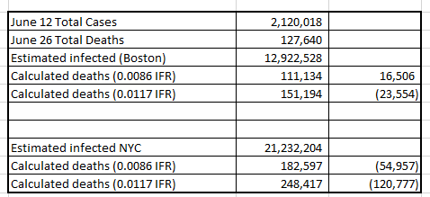
Thus, comparing the benefits to harms, at least 5 times more lives are lost than saved by the full course of Pfizer mRNA vaccinations.

At the time of the writing of their paper, there was, and still is, data collected by numerous reputable sources that would show this calculation to be wrong. That is, it does not match what we see. Even if the authors want to claim that actual deaths are kept from us, it would be difficult to accept that all these different government bodies who collect data were all in on keeping the data from us.

March 27, 2023 the UK Office for National Statistics writes

Several studies have reported associations between coronavirus (COVID-19) vaccination and risk of cardiac diseases, especially in young people; we assessed the impact of COVID-19 vaccination and positive SARS-CoV-2 tests on the risk of cardiac and all-cause mortality in young people (aged 12 to 29 years) in England using a self-controlled case series design.

There was no significant increase in cardiac or all-cause mortality in the 12 weeks following COVID-19 vaccination compared with more than 12 weeks after any dose for the study population as a whole.

They did find:

 According to the statistical model, 11 out of the 15 cardiac deaths in young women that occurred within 12 weeks of a first dose of a non-mRNA vaccine were likely to be linked to the vaccine; this corresponds to 6 cardiac-related deaths per 100,000 females vaccinated with at least a first dose of a non-mRNA vaccine.

Only females and only females within this age group based on reports of elevated risk of cardiac disease in young people. 


The CDC writes:

To assess mortality not associated with COVID-19 (non–COVID-19 mortality) after COVID-19 vaccination in a general population setting, a cohort study was conducted during December 2020–July 2021 among approximately 11 million persons enrolled in seven Vaccine Safety Datalink (VSD) sites.§ After standardizing mortality rates by age and sex, this study found that COVID-19 vaccine recipients had lower non–COVID-19 mortality than did unvaccinated persons. After adjusting for demographic characteristics and VSD site, this study found that adjusted relative risk (aRR) of non–COVID-19 mortality for the Pfizer-BioNTech vaccine was 0.41 (95% confidence interval [CI] = 0.38–0.44) after dose 1 and 0.34 (95% CI = 0.33–0.36) after dose 2. The aRRs of non–COVID-19 mortality for the Moderna vaccine were 0.34 (95% CI = 0.32–0.37) after dose 1 and 0.31 (95% CI = 0.30–0.33) after dose 2. The aRR after receipt of the Janssen vaccine was 0.54 (95% CI = 0.49–0.59).

Concluding: 

There is no increased risk for mortality among COVID-19 vaccine recipients. This finding reinforces the safety profile of currently approved COVID-19 vaccines in the United States.


The Lancet, June 2022, in a paper titled "Safety of mRNA vaccines administered during the initial 6 months of the US COVID-19 vaccination programme: an observational study of reports to the Vaccine Adverse Event Reporting System and v-safe" writes:

During the study period, 298 792 852 doses of mRNA vaccines were administered in the USA. VAERS processed 340 522 reports: 313 499 (92·1%) were non-serious, 22 527 (6·6%) were serious (non-death), and 4496 (1·3%) were deaths. The following tables breakdown what they found:


These three credible sources all show a very different risk outcome "of 27 deaths per 100,000 doses of BNT162b2." Reality shows us differently and that reality had to have been known to the authors since they are very clear on how their paper was extensively cited paper with 293 references (average paper has 30)"

That deals with the deaths they state as a risk of getting the vaccination. They also make a claim that "for the BNT162b2 injection, a generous estimate would be two lives saved from COVID-19 for every 100,000 courses of the biological."

This means - if I am reading it correctly - that their risk calculation projects only two lives saved per vaccinated individual. This means that for all intents and purposes the vaccine does nothing to save lives. Which means that we should see the roughly same amount of deaths from COVID-19 between those vaccinated and those not vaccinated. The author's write "approximately 52,000 vaccinations would be needed to prevent one COVID-19-related death."

That's their conclusion in glorious black and white pixels.

What does the data they had available to them show? Do we see the same results between vaccination and those not vaccinated. Let's do a Google search...  

Here is what the CDC reports:

Among persons aged ≥12 years, a total of 21,296,326 COVID-19 cases and 115,078 associated deaths were reported...from 24 U.S. jurisdictions....During all periods, average weekly age-standardized incidence and mortality were consistently higher among unvaccinated persons (ranges = 216.1–1,256.0 and 1.6–15.8, respectively) than among monovalent-only vaccine recipients (ranges = 86.4–487.7 and 0.3–1.4, respectively)...

If the authors of the retracted paper were correct, we would not see a weekly mortality that is lower for the vaccinated cohort (0.3–1.4) then the unvaccinated cohort (1.6–15.8). Once again, reality says something very different then the risk of lives saved they calculate and use to support their contention that the vaccine must be stopped.

The following was easily found data which shows that lives saved by the vaccine is considerable - or to use one of their words 'significant.' 

From the Washington State Department of Health (December 2023)


Scientific American (June 7, 2022):


Arizona Department of Health Services (6/7/2023)


When the authors write in their 2024 paper:

Thus, applying these reasonable, conservative assumptions, the estimated harms of the COVID-19 mRNA vaccines greatly outweigh the rewards: for every life saved, there were nearly 14 times more deaths caused by the modified mRNA injections (for details, see Appendix 2).

 They were either not being honest when they wrote this because they should have done a tiny modicum of research to see if their claim that their "reasonable, conservative assumptions [about] the estimated harms of the COVID-19 mRNA vaccines" actually matched reality, or they just don't care if the facts don't align with their feelings.

I am flabbergasted and dumbfounded as to how seven advanced degreed people and an " following an intensive review process that lasted several months and included multiple editors and reviewers," allowed this easily verifiable 'assumption' to get through. This alone should have thrown the paper into the rubbish bin.

Just because you do math and call it an 'assumption' does not excuse it from having to stand up to a tiny bit of credibility. It is another swing and a miss by those who don't like vaccines to scientifically prove why they are correct in their fear and dislike of this vaccine and/or all vaccines in general.

There is no censorship here. No violation of the Committee on Publication Ethics, No false, misleading, and unsupported by evidence claims by the Journal. Nothing arbitrary and capricious by Mr. Kersjes. This is a paper that makes claims that do not match reality, a reality that was available to all seven of the authors. Discounting all the research from all different parts of the globe by all different types of scientists, from many varied entities because it does not fit the conclusion you want - "a global moratorium on the modified mRNA products" - is bad science and they should be ashamed.

Their call for a moratorium "until all relevant questions pertaining to causality, residual DNA, and aberrant protein production are answered" is disingenuous because they will never allow their minds to be changed no matter what evidence they are shown.

Point goes to Mr. Kersjes, the retraction is warranted.

Note: I am becoming more and more convinced that peer reviewed is nothing more than a you scratch my back, I'll scratch yours. 


Friday, March 15, 2024

Vaccines for COVID-19: Censorship or Misrepresentation of the Data - Part 1

It has been a while since I wrote in this blog. Figured I should post this because I want to understand what is being said, claimed, and argued about in a YouTube video I just watched.

This showed up in my YouTube recommendations:


Never hear of her, but she's an MD and was apparently duped by some paper on something (spoiler alert: no she was not!).

"I reviewed a paper about Covid-19 on this channel that's been retracted..."

Well that's worth a listen to.

I may write about what she said, but what I want to do first is understand what the retraction is all about. Let me take a look at the link she provides...


Yeah, so after listening to her video and wondering why she does not really address the Journal's issues with the paper and instead goes over the paper and its findings, I can see where her opinions on the validity of the Editor's reasoning for the retraction are coming from.

And this is confirmed by reading the comments all supporting the same vaccines are bad and they want to cover it up group think. I want to keep an open mind on this, as with any claims made by researchers. However, I - WE - need to go where the data takes us, not where we want it to take us to fit our 'feelings' on the topic. 

Let's get into the weeds about this claim of censorship through retraction.

The paper [being retracted] called for a halt in COVID-19 mass vaccination based on a valid evaluation of the evidence. It topped >330,000 views/reads/downloads in a month as compared to an average Cureus-promoted paper which has only ~2700 in a year.

Right there we have one of those logical fallacies we read about. The fact that the paper was viewed 330,000 times means nothing in terms of its validity of its findings and conclusion. The article doubles down on this by stating:

A rating of >9.2 is considered “excellent” and “groundbreaking” appropriately characterizing this extensively cited paper with 293 references (average paper has 30

References cited are just references cited. It's how they are used to support the claims of the paper that matter. The article then goes on to make the argument that if the paper was not rejected during the peer review process "Once published, it is a violation of the Committee on Publication Ethics (COPE) Guidelines to retract paper without adequate justification."

The censorship claim, it appears, is that there is not adequate justification to retract it and the publication is just outright wrong in their reasons to do so. This is something I was hoping that Dr. Boz was going to address on why she was duped, or. more importantly for her - why she was not - that the paper stands as valid and the retraction is unjustified.

Because she did not, I now have to for myself, because I want to make sure that how I 'feel' about this is sound. I know how she feels about it, how her audience feels about it, and how the authors and Courageous Discourse feels about it. What I want to understand better is should I feel the same and be moved to consider the authors of the paper's claims as valid even though I hate the logical fallacies used and their claims of 'Censorship!" and "Violation!"

The issue with the retraction starts with a letter to the authors by Tim Kersjes, the Journal's Research Integrity Advisor.


Courageous Discourse includes their rebuttal to Mr. Kersjes letter, writing:

The statements made by Kersjes are false, misleading, and unsupported by evidence. Several claims were also arbitrary and capricious. Most of the statements appear to be adapted, either directly or indirectly, from the numerous comments made by the well-known vaccine industry social media trolls, Jonathan Laxton and Matthew Dopler...

 This response is an entertain read if you like drama and childish name calling. Entertaining, but distracting from the question of are the eight statements made by Kersjes "false, misleading, unsupported by evidence," and/or "arbitrary and capricious?"

I may decide to write about all eight of them, but that takes a bit of research for me to understand if the claims are indeed unfounded. For now, I want to focus on two of them.

Let us look at Kersjes (No. 2) claim:  We find that the article appears to be misrepresenting VAERs data...

“Based on a query of the MedDRA code ‘Autoimmune disorder’ in the Vaccine Adverse Events Reporting System (VAERS), there was an 803% increase in autoimmune disorders per million doses administered when comparing the administration of Influenza vaccines from 2018 to 2020 with COVID-19 vaccinations from 2021 to 2023 (Figure 5) [173]. This represents an immense safety signal.”  All eight reviewers agreed with this wording and interpretation.

Notice the "803% increase" and then "This represents an immense safety signal."

I have made this comment before. Numbers used to convey how you want the public to see your findings is disingenuous because it is done purposefully to support the claim the authors want to see. 803% is not a false statement. And the term "immense" is subjective as all get out because the authors did not define what they mean by immense.

Is it immense because its an 803% increase or is it immense in terms of the number of people impacted by autoimmune disorders once they receive the vaccine? Context matters here. I have a very difficult time giving a pass to anyone who wants the research published. The authors new what they wanted that 803% to convey and they knew that the peer reviewers could find no fault with it because its a factual number. They should have taken issue with the term 'immense' but because they did not, the authors an claim it was appropriate.

Context...

What does an 803% increase actually mean?


The devil is in the details. If person A makes $10.00 per hour and receive a raise up to $20.00 per hour that's a 100% increase. If person B makes $100.00 per hour and gets a 100% increase they now make $200.00 per hour.

Both received a 100% raise, which one got the bigger impact? Context matters here.

When you look at their 803% graph, you see that autoimmune disorders (adverse effects [AE]) for the influenza vaccine was 0.1 per million doses. If I am reading this correctly, this means that will be one AE for every 10 million doses.

The COVID-19 vaccine showed 10 AEs for every 10 million doses.

There is an increase here, but I am unsure if  'immense' was the appropriate word to use to describe it.

Context...

Claim No. 2 for Figure 5 seems valid. Point goes to Mr. Kersjes for retraction. Figure 7 does not present the same type of misleading statements as Figure 5. There is also research to be found that shows a spike in heart issues for teenage boys. If that spike is reason to halt COVID-19 mass vaccination is debatable so reporting it to support their claim - in my opinion - is not, by itself, false or misleading. 

Now on to Part 2.


Tuesday, July 21, 2020

COVID-19: Down the Rabbit Hole of Death Rate Calculations - Part 7

Note: Written June 30th

Based on my calculations [see my last post], which were based on antibody testing done in New York where they calculated "19.9% of the population of New York City had COVID-19 antibodies," my worst case death rate if we do nothing more than wait for herd immunity we would see 1.97 to 2.68 million of our fellow Americans dead assuming 70% needed to reach herd immunity.

I know that number will be less than that based on the fact that some of us are taking precautions as well as changes in the way we treat the sick resulting in less deaths. How much of a decrease in my numbers depends on a lot of factors, so worst case of doing nothing will see a lot of deaths, even if you reduce the 70% needed down to 50% for herd immunity.

How does the antibody testing done in New York compare to the testing they did in Boston?
Mayor Martin J. Walsh, together with Massachusetts General Hospital (MGH), and the Boston Public Health Commission (BPHC), today announced the study to evaluate community exposure to COVID-19 through a representative sampling of asymptomatic Boston residents resulted in 9.9% testing positive for antibodies and 2.6% of currently asymptomatic individuals testing positive for COVID-19. In conclusion, approximately 1 in 10 residents in this study have developed antibodies and approximately 1 in 40 currently asymptomatic individuals are positive for COVID-19 and potentially infectious. 
Let's do the same process as we did in the last post.
More than 5,000 residents living in East Boston, Roslindale or within the boundaries of zip codes 02121 and 02125 in Dorchester were invited to voluntarily participate in the study, with total outreach representing more than 55% people of color. Approximately 1,000 residents expressed interest in participating and 786 residents were deemed eligible. Of those, 750 residents enrolled in the study and received the required testing. Residents with symptoms or a previously positive COVID-19 test were disqualified from the study.
So...1 in 10 residents in this study have developed antibodies EXCLUDING those who have tested positive and recovered. Let's settle on a date of May 15 for the News Release and May 12 for the last day they looked for antibodies.If we say that everyone's outcome was resolved on May 12, you either had antibodies or you were dead. And if you died, we got your death reported at least by May 19 (7 days).

If this is the case, then the numbers look like this for the IFR:

Source
Source

Interesting...An IFR of 0.86% was also calculated with NYC.

Right now we have so reasonable data from which to work. We know dates, we now counts, we can make some calculations and we can make some assumptions. It is unfortunate that we will not know a 'true' number until the end. What we can know are reasonable numbers based on what we see, and, using those number we can rule some things out.

Looking at the data from Boston and NYC as well as the current data as of 6/26/2020, here is what we get:

For Boston, we had 11,395 confirmed cases for 69,458 (10% of Boston) assumed  past infected.Using these two numbers, we can assume that for every known case (11,395) the are 6.095 times more cases that were not reported.

Using those numbers, we can get an estimate as to how close out calculated IFRs are using US data for the whole country.


If our infected to confirmed cases ratio is correct, then the best fit for the deaths reported is an IFR of 1.17%

If we use NYC's numbers, the ratio of confirmed cases to assumed past infected is 1 to 10.02:


However, that ratio estimates way more deaths then reported.

If we work backwards, that is we have the reported deaths and we have an estimate of infected (as of 5/25), the IFR calculates as follows:


Assuming nothing has changed, that is the same number of non-tested people remains as per Boston (1:6) or NYC (1:10) we should be able to see very close numbers now that we are into this epidemic by another month.

We have death data as of June 26. Assuming there is at least a 14 day lag between a case being reported, death, and posting of that death, we can look at the cases as of June 12.


In my opinion, the best model that takes into account what we have seen based on reporting is the Boston numbers. That is, for every confirmed case there will be six unconfirmed positive cases. 

The IFR, however, is a different story. In the beginning it was 1.17% that would get you close to the actual deaths reported. As time goes on, that number drops to 0.8%.

There are a couple of things going on here that could be impacting the IFR:
  1. The number of deaths from COVID is decreasing due to better care
  2. More vulnerable have died already 
  3. Less older folks are getting infected with youth driving up the numbers and therefore less deaths from that age group.
  4. The number of confirmed cases now includes more asymptomatic cases that were not known to be infected early on (decreasing the ratio to be less than 1:6)
To my way of thinking, we should not see to big of a jump in the IFR between what was calculated before May 11 and what has happened from May 12 to June 28 (the latest date I have access to).

The estimated IFRs should hold close, If the IFRs do not calculate the deaths seen from this period, something has changed. I suspect it is all four of the above with number four being the primary driver as we ramp up testing.

Let's go down that rabbit hole and see.

Part 8

COVID-19: Down the Rabbit Hole of Death Rate Calculations - Part 10

Note: Written July 7

Where are we? Oh yeah, something about deaths only 5.9% above normal...

That statement was made when the graph below ended at the right edge of the purple box. Since this series of blog posts is taking me a bit longer than I thought to write, the number of cases - and therefore deaths - keeps marching on.

The June 25 number of deaths was 127,532. Assuming a 14 day lag from reported cases to reported deaths, the last cases would be June 11 and at that time the numbers were 2,091,812 total COVID-19 cases reported.

We once again come back to the Infection Fatality Rate (IFR) and that brings us back to how many people were actually infected, not the number reported as cases.

In a previous post I calculated that Boston shows us 6 not reported to each reported. New York City shows 10 infected to each one reported as a cases. Those numbers were early on and I think them appropriate for what took place in April. I believe we have a better understanding of what is taking place looking at the Diamond Princess for example.

In this video, a screen shot of the data he was using shows this:


Let's assume that these numbers represent the population in the US as of June 11. What this video contends is that 37 + 21 = 58 out of 155 asymptomatic had the antibodies, Of those that had symptoms, 25 tested positive for the virus.

Assuming that those with symptoms go and get tested, and only positives are reported, we would have 25 reported and 58 unreported. So for every positive reported cases there are actually 2.32 more cases.

25 reported, 58 unreported for a total of 83 infected.

Using this logic...

The number of cases from June 12 through June 22 was 298,465. If we add to that 2.32 times more asymptomatics that were assumed not tested, that gives us a total of 990,904 infected.

With a total of 5447 deaths for that time period (14 day lag in reporting), we get a Case Fatality Rate of of 1.83% and an Infection Fatality Rate of 0.55%.

If my calculations are correct...if my assumptions are correct, by July 20th we will have 24,102 deaths from the cases reported after Memorial Day, May, 25 - a 56 day time frame.
  • Cases after May 25 through July 6 = 1,320,681
  • Estimated Infected = 4,384,661 (tested plus untested asymptomatic)
  • Estimated deaths for this 56 day period starting on June 8th: 24,102
  • Actual deaths reported from June 8 through July 20th - 56 days: ????
Out of the rabbit hole for a bit. 

I'll be back after July 20th to see how close my estimate of the deaths were. If it is more than what I calculated then the IFR is higher and we can expect a lot of deaths as we try to get closer to herd immunity of most likely 70% of the US population needing to be infected.

Part 11 coming after July 20th....


COVID-19: Down the Rabbit Hole of Death Rate Calculations - Part 9

Note: Written July 7

You are Donald Trump...or any other non-science/non-public health educated person in a leadership role.

You are looked at to do something...take precautions to keep people safe or hurt the economy. It is not an either/or decision, but unfortunately that is how it was presented.

You may have your own opinions about risk, about life and death...but in the end, the decisions you make are, at the very least, backed up by data that you can point to an say "...this is what I was told."

I am on my 9th post on this topic of the death rate associated with COVID-19 because the data has been contaminated and manipulated to paint a picture that ...it aint that bad...its no different than the flu...it will fizzle out...

So you are Donald Trump and your CDC gives you this 49 page report, that - let's be honest - you will not read. But you can look at the pretty graphs, and the graph you fixate on - because its the one that most people are concerned with - is the number of deaths.

And the CDC shows you this:


Even Trump can look at this graph and come away with an idea as to what is happening. But just to make sure, the CDC tells him:
This is the ninth week of a declining percentage of deaths due to PIC; however, the percentage remains above the epidemic threshold of 5.9% for week 25.
Trump: "What's that mean?"

CDC: "Well boss, we are now only 5.9% higher in deaths then we normally would see at this time."

Trump: "6%...so we are pretty good...would you say tremendous maybe?"

CDC: Well if you look at the data, 6.9% of all the deaths that week were due to pneumonia, influenza or COVID-19.

Trump: So 7% of the deaths were not just from COVID-19...its also the flu and pneumonia?

CDC: Well sir, if you look at how things were in 2018 with just the flu, we are less deaths than that...

Sycophants: And no one shuts down the economy over the flu!

Me: But sir...let me explain what's happening....

Sycophants: Shut up Bowman!

Well this is my blog and I don't have to shut up. Let's look at the graph with some context.

In a bad year, like 2018, the flu infected an estimated 45,000,000  Americans - and that was with a large percentage of people having received a flu shot.

On June 20th we had a total of 2,334,098 confirmed cases of COVID-19. Now go back and compare the the flu death bump for 60 million infected with the COVID-19 bump with as of June 20th 2.3 million infected.. .

When the CDC tells the people that as of June 25th we are only 7% higher than what we normally see at this time for all deaths it sort of sounds like we got it under control! We win! USA...USA...

That graph tells us a percentage of death due to infection. This works well if your goal is to convince the public that the red line is now about the same as what we see with the flu...and no one shuts down the economy for the flu. 7% higher...Pffft!

In the end though, it is all about the deaths that I am interested in. And right now, we are looking at this:
  • 127,532 deaths as of June 25 from 2,091,812 COVID-19 cases as of June 11 (14 day death lag)
  • 46-95,000 deaths from 45,000,000 cases for flu 2017-2018.
...and Mr. Toad's Wild Ride is not over yet.

When the CDC tells the president that we are only 5.9% higher in deaths then we normally see at this time, it sounds...reasonable. But it ignores the epidemic part of the equation...it ignores exponential growth...


The purple box represents what we assume to know about the number of deaths as of June 25th from the cases starting at 0 to June 11th.

The purple box represents 127,532 deaths. What will we expect from the red box? What will we eventually see at the end date of zero infections and the last death associated with COVID-19?

This is what the infection fatality rate becomes critical in the thinking process. If 5.9% above is acceptable because its only 5.9% above what we normally see, and below what we accept with the seasonal flu, then maybe all this worry over it being a concern is misplaced.

5.9% was the right edge of the purple box. What does the red box tell us?

This rabbit hole is way too deep!

Part 10

COVID-19: Down the Rabbit Hole of Death Rate Calculations - Part 8

Note: Written June 30th

How do the number of deaths to number of reported cases to my calculated IFR and my calculated cases/infection ratio pan out?


Something changed...

I suspect that the decrease in the CFR is based on more testing, younger people getting infected, and better health outcomes. All of these are good news, but make it difficult to figure out what the Infection Fatality Rate (IFR) is if our leaders really push for herd immunity as our way out.

The IFR can give us an estimate of the number of deaths we could expect if all we do is wait for herd immunity to control the infection.

My best guess as to the number of infected is based on what we found with the Diamond Princess and the Aircraft Carrier Theodore Roosevelt. What we see there, one with old folks and one with healthy young people, should give us an idea on what is happening in the US as a whole.

Among 3,711 Diamond Princess passengers and crew, 712 (19.2%) had positive test results for SARS-CoV-2 (Figure 1). Of these, 331 (46.5%) were asymptomatic at the time of testing. 
A new U.S. study of the COVID-19 outbreak aboard USS Theodore Roosevelt (CVN-71) found that one in five sailors infected with the virus were asymptomatic, while the loss of smell and taste were the most common symptoms of the disease.
This asymptomatic number is critical in figuring out who is getting tested and who is not. In both these cases testing was provided to all and was not reliant upon a person going in to be tested.

We do know that because of the shortage and cost of tests, many asymptomatic people who knew they were exposed were discouraged from testing or chose not to partake.

We can assume, therefore, that if for every one symptomatic case on the Diamond Princess there was an asymptomatic infected person, for every one case reported you have twice that many infected.

If you look at the USS Theodore Roosevelt, symptomatic appears to include "loss of smell and taste." I speculate that in the US population those symptoms would not drive many people to get tested. Unfortunately, the research does not break down what percentage of those tested who positive only reported loss of taste & smell or mild symptoms. What they do report is that for every five symptomatic, one was asymptomatic.

Based on the Boston numbers, I am going to assume an IFR of 0.86%. I think that is reasonable in calculating an upper bound number of deaths should herd immunity be the only course of action.

Using the most recent numbers from above, here is what I calculate


What these two tables attempt to show is how close my model (IFR and Ratio of cases to asymptomatic non-reported cases) can get to the numbers reported in WorldoMeters.

There are a lot of assumptions here, but I am looking to get a reasonable estimate so as to calculate what herd immunity might cost us in lives lost to COVID-19.

As time goes on, I think we will - or have - seen less vulnerable people getting infected as well as better health outcomes for those who are symptomatic.

I also think we are testing more and capturing more asymptomatic people which increases the known cases reported.


This assumption seems to be borne out by my calculations as they switch (more known cases both symptomatic/asymptomatic) and an IFR of 0.86%.

What does this all mean?

Well we need to consider an IFR of at least 0.86% ans we need to recognize that the number of reported cases does not equal the number of total infected. More testing is needed to know how many have had COVID so we can know if out health care has improved and what risk of death we can expect.

Need more data!

Down the rabbit hole of death we go. Time to meet the President.

Next Post Part 9

COVID-19: Down the Rabbit Hole of Death Rate Calculations - Part 6

Note: Written June 26th

Using information from the Diamond Princes, I calculate an Infection Fatality Rate (IFR) of 5.6%. This assumes that the total number of infections can be obtained by knowing the number of confirmed cases and adding 17.9% more to cover the asymptomatic cases that were never tested because,,,well they never knew they were sick.

The issue with this IFR calculation is that it is based on what took place within a population with a median age over 60.

Need more better data!

The WorldoMeters calculates a mortality rate by looking at antibody testing performed in New York and the data out of New York they reported this.
Considering that a large number of cases are asymptomatic (or present with very mild symptoms) and that testing has not been performed on the entire population, only a fraction of the SARS-CoV-2 infected population is detected, confirmed through a laboratory test, and officially reported as a COVID-19 case. The number of actual cases is therefore estimated to be at several multiples above the number of reported cases. The number of deaths also tends to be underestimated, as some patients are not hospitalized and not tested.
Based on the "analyzed the data provided by New York City, the New York State antibody study, and the excess deaths analysis by the CDC. Combining these 3 sources together we can derive the most accurate estimate to date on the mortality rate for COVID-19, as well as the mortality rate by age group and underlying condition."
The survey developed a baseline infection rate by testing 15,103 people at grocery stores and community centers across the state over the preceding two weeks. 
What they found was:
  • 12.3% of the population in the state had COVID-19 antibodies as of May 1, 2020.
  • 19.9% of the population of New York City had COVID-19 antibodies.
Looking at New York City...:
With a population of 8,398,748 people in NYC, this percentage would indicate that 1,671,351 people had been infected with SARS-CoV-2 and had recovered as of May 1 in New York City. The number of confirmed cases reported as of May 1 by New York City was 166,883, more than 10 times less.
What this says to me is that if you were tested and found with antibodies you were past the active infection period and on May 1 you had ether recovered or died. I am going to calculate this a bit different than WorldoMeters because I am going to assume the deaths on May 1 happened 7 days prior. So I am going to look at the deaths reported in NYC on May 9. [I am using 7 days to account for the lag in reporting the deaths, so if we stop on May1 our deaths should - should - be accounted for in the May 9th report]

The IFR is therefore [total deaths] divided by [total recovered plus total deaths].This gives me the pool to pull from, what portion died and what portion survived.


If the New York serum data is correct, we have an IFR of 0.86 to 1.17%. What this could mean in terms of deaths of real people should we continue down the path of waiting for herd immunity as the stopping point looks like this:


If my calculations are correct, and y'all can check my math, if we rely on herd immunity - as some are recommending - we could see 1.97 to 2.68 million of our fellow Americans dead assuming 70% needed to reach herd immunity.

Maybe Boston presents a better estimate...

Down the rabbit hole to Boston we go!

Part 7